FONTS | COLORS | LOGO BASICS | BUCKEYE ART | PRINT SERVICES | ILLUSTRATION
EHE Marketing and Communications provides graphic design services for a variety of uses throughout the college. We can assist with newsletters, giving opportunity materials and also help create promotional materials for events.
Digital Signage
The College of Education and Human Ecology supports the installation and maintenance for digital signage display. Designated persons along with OIT staff will have access to a cloud portal where they can create and update content for public display.
Accessibility
The Ohio State University is committed to providing an online environment that is accessible to everyone. Please visit the Ohio State Digital Accessibility Services and Ohio State’s Digital Accessibility Policy for more information.
Large College Reports
For large college-wide reports, departments/committees that are working to prepare the report should compile the various sections of the report and then schedule a consultation meeting with the MarCom team for assistance in editing the report for university style and to create any needed cover or other graphic design elements. Reports should be formatted and have all necessary tables and table of contents and appendixes in place before sending on to the MarCom team. After MarCom has completed the style edits and provided the needed graphic design elements, a member of the team will provide the report back to the administrative assistant in the department or office charged with producing the report.
Fonts
Our fonts help create distinctive Ohio State experiences wherever words are used visually.
Even the most basic information can come to life with fonts, making headlines feel conversational and data tables more engaging.
These guidelines demonstrate how to use fonts to reinforce message hierarchy and build visual brand consistency within your marketing and communications.
Buckeye Serif
Our serif font, Buckeye Serif, offers an academic sophistication while maintaining a warm, conversational feel with its combination of soft curves and angular serifs.
Buckeye Serif offers a range of weights and conveys the boldness, vitality and approachability of Ohio State. Its bolder weights work well for headlines, and its lighter weights for body copy.
Buckeye Serif Regular
Buckeye Serif SemiBold
Buckeye Serif Bold
Buckeye Serif Black
Buckeye Sans
Our sans serif font, Buckeye Sans, is a well-balanced, highly readable font that blends functionality with vibrancy and energy. Its large x-height allows for greater legibility and clarity, particularly at small sizes. Buckeye Sans pairs exceptionally well with our Buckeye Serif.
Buckeye Sans Regular
Buckeye Sans SemiBold
Buckeye Sans Bold
Buckeye Sans ExtraBold
Buckeye Sans Black
Fonts are available for download below. Please contact your IT department for assistance to download Buckeye Sans. Web fonts are available through Buckeye UX, Ohio State’s design system. For additional guidance on font usage, contact brandcenter@osu.edu.
Colors
Color is one of the most powerful aspects to help deliver upon our brand experience principles — setting a tone for each of our pieces.
Our color palette helps audiences identify us at a glance, and the way we use color sets the mood for each of our pieces. Using our color palettes consistently and appropriately is one of the most effective ways our communications create a recognizable Ohio State look.

Our Primary Color Palette
Our primary colors — scarlet and gray — have been Ohio State’s official colors since the university’s earliest days. Consistent and appropriate use of our primary identity colors is one of the most effective ways our communications create a recognizable Ohio State look and enhance moments of connection.
Our primary palette consists of scarlet (red), gray and white.
For offset printing, UniPrint recommends using shades of black ink in order to consistently reproduce shades of PMS 429.
Takeaways
- Our primary color palette includes the signature colors by which our audiences readily identify Ohio State. Remember: There are many other schools whose color is red, but only Ohio State is scarlet and gray.
- Use scarlet and gray in all marketing and communications materials.
- Scarlet is a bold color and integral for our brand look. A moderate amount, however, goes a long way.
- Use darker shades of scarlet to differentiate an element from our primary scarlet, such as a button hover state or in a background pattern.
- Think about white as a color.
- Use black when needed for legibility of text and to meet accessibility contrast requirements.
- Do reference our color matching tips on reproducing PMS gray in offset printing.
- Use the proper specifications to ensure consistency and protect our signature colors.
- Do not use lighter shades of scarlet.
- Do not replace our primary colors (PMS 200 and PMS 429) with shades of scarlet and gray. Shades should support primary colors.
Our Accent Color Palette
Looking to use additional colors? To discover our accent colors and how to use them, visit the university brand site.
EHE Logo Basics
The logo for the College of Education and Human Ecology is a variation of the university’s logo and the primary identifier used in all college communications.
Consistent and correct use is essential to reinforce the brand recognition and reputation of the college to our audiences.
Like the university, the college identity system prohibits the use of any additional iconography, marks or artwork in conjunction with the college logo.
College Logo Elements

Block O
The iconic identifier of The Ohio State University. The Block O should be displayed with the wordmark and secondary signature at all times.
Wordmark
An adjusted letterform version of the name “The Ohio State University” combined with a baseline. It cannot be replicated through typesetting.
Secondary signature
The college identifier including the name “College of Education and Human Ecology.”
Configurations and Clear Spacing

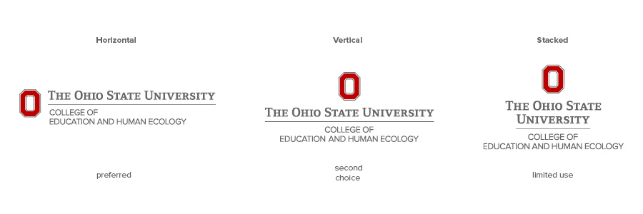
There are three approved configurations of the college logo, of which the horizontal is the preferred and primary version. The vertical and stacked logos are distinct options, and none of the three should be recreated.
- Horizontal logo (preferred)
- Vertical logo (second choice)
The vertical configuration may be used in circumstances when the horizontal logo is impractical to use. Stacked logo (limited use)
The stacked logo is for use in restricted spaces where neither the horizontal nor the vertical version is feasible, such as one-column ads, podium signs or certain merchandise or apparel.
“Clear space” is the protected area around the college logo that maximizes its impact. The space must be free of all other graphics and text, including other logos. The minimum required space around the logo is defined by the width of the Block O.
Other important notes
The logos must not be altered in any way, and additional configurations are not permitted. Do not recreate the logo.
When the logo appears on merchandise or apparel, it should always have the registration mark, (®). The registration mark is not needed on stationery, marketing collateral or digital communications.
Minimum Size
The Block O should not appear smaller than 0.375 inches tall in print. For digital, the minimum size is 32 pixels tall, but the preferred size is 50 pixels. The proportions of the Block O in relation to the rest of the logo should not be changed.
Color Variations

The preferred use is scarlet and gray on a white or light background. This version should be used whenever possible. If the preferred use is not possible, the following variations (and only these variations) may be used:
Scarlet and gray (preferred)
Scarlet and black
Use when the background requires a darker representation of the wordmark.
Black
Use when ink colors are restricted or the use of scarlet creates a design conflict. (However, always incorporate scarlet in your design.)
Scarlet
Use when ink colors are restricted or to achieve a particular design effect.
Gray
Use when ink colors are restricted or to achieve a particular design effect.
One-color reverse (preferred reverse version)
Two-color reverse
When scarlet is needed in a reverse logo, use the two-color version.
Logo Placement

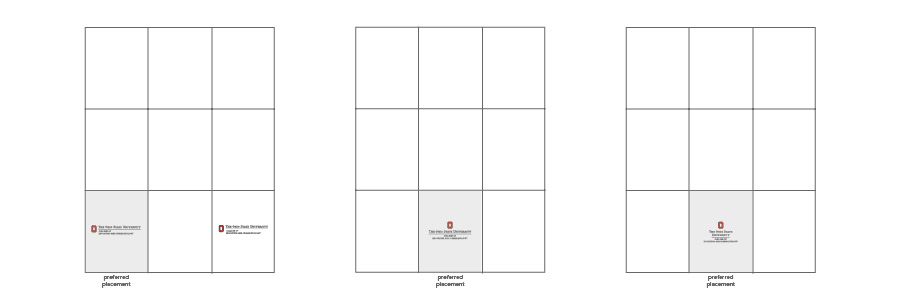
Logo placement is important to achieve maximum impact. Optimal placements for each logo configuration are illustrated above.
For centers, departments, programs, offices or other units in the college, Ohio State has developed a visual identity system to provide design prominence. A unit name may not be typeset to appear integrated with the college logo.
For assistance with college logos, please contact a member of the EHE Communications team.
Buckeye Art
Need to incorporate Brutus into your design? What about our university themed graphics and patterns? To learn about Buckeye art and how to use it, visit the university brand site.
Printing Services
UniPrint Phone: 614-292-3450, Email: uniprintcustserv@osu.edu
Illustration
EHE Marketing and Communications provides graphic design services for a variety of uses throughout the college. We can assist with newsletters, giving opportunity materials and also help create promotional materials for events.
More questions? Contact our team.
